Good Logo Design

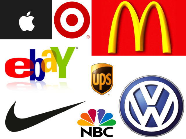
The familiar Nike swish, the red and white bull’s-eye of Target, the reverse silhouette of the Apple brand … you know them well.
But what makes a good logo?
The first thing to consider is that a logo is not just a mark or image; it is a reflection of the company.
Logos can represent a business or a product (e.g. Procter & Gamble vs. Tide detergent … Lennar vs. one of its communities).
A good logo is recognizable and inspires trust in the brand.
A poorly designed logo can have negative consequences (e.g. logos that are too complicated are hard to read or understand and don’t communicate well).
Effective logos share four characteristics:
- They are describable
- They are memorable
- They are effective even in black and white (e.g. the McDonald’s “golden arches” M is just as recognizable in black-and-white, isn’t it?)
- They are scalable (can be enlarged and reduced without sacrificing readability)
Other attributes of successful logos:
- They are distinctly different from the competition
- They project the image of the company (formal vs. less formal)
- They can adapt to the direction the company takes as it grows (e.g. the name and design doesn’t limit the company to a niche market)
- They can be type only or incorporate an image
- They can have meaning (e.g. Nike swish is a depiction of the famous statue of the Greek Goddess of Victory, Nike)
How to craft an effective logo?
Conceptualize
Here at WhiteHOT, the logo design process begins with writing a design brief that clearly sets forth what you want to achieve with the logo, plus some background on the brand. This provides direction for our research and brainstorming phase.
Draw
We then sketch some logo ideas in black and white first (remember: it is critical that a logo “translates” into black-and-white and doesn’t just work when rendered in color). We do, of course, also provide our clients with prototype logo ideas in color (with the future costs of printing in 4-color to consider, it is often desirable to limit the logo to one or two colors).
Review
After client review and perhaps one or more revisions to refine the concept, we arrive at the final logo. A simple process, yes; but not always an easy one. We are always cognizant that a logo needs to represent the essence of our client’s business, so the time and effort expended in “getting it right” is never taken lightly.
Launch
A proper launch of the logo is the step that is often missing from the process – but we take it very seriously. We like to announce the logo using advertising, marketing and PR – just as you would when launching a new product. And, just as you would build the reputation of a new product, there are three watchwords: Repetition. Repetition. Repetition. Use your new logo everywhere, on everything, in every medium – in order to imprint it on the minds of your intended audience. Print ads – billboards – business cards and stationery – marketing collaterals – signage – television – social media – website … consistency is key.
A successful logo stands the test of time. Once you’ve launched it, you must be prepared to “live with it” for years to come, and our comprehensive design and launch process ensures long-term relevance – which is why our phone rings with logo design requests pretty regularly.
Is this the year you launch a new image for your company?
WhiteHOT, Inc. is led by owner Phil Clouser, a seasoned creative director with over 25 years in sales and marketing. Whether you’re doing a full-blown campaign or a single project, we do it more competitively than the big agencies. That’s the advantage of our streamlined, boutique approach. We are aggressive as well as responsive. We’ll meet with you, analyze your goals and expectations, design your project, and expedite it before the “big guys” assign a team and traffic number. Call Phil today at 609-577-4314 to get the best value for your money, without the aggravation!